Let’s face it, within the reading world one thing most of us can agree on is we can’t stand it when the cover of our beloved books are changed to the movie poster. Before we can even start saying, “SHE HAD BROWN HAIR IN THE BOOK!” during adaptations, we often have to see beautiful cover art replaced with photos of actors. I get why publishers do it- it’s a great way to get people to notice and potentially buy a book. But for book nerds, it is one of our biggest pet peeves.
There are so many different covers for books aside from ones hijacked by movies so it’s not uncommon for us to have read editions of books that look completely different from each other. I live in the US and UK so I come across this a lot, especially with paperbacks and used books. It doesn’t really bother me, it’s what’s between the cover that counts, but I do have to say I’m not really a fan of ones that have photos of people on them. I like to be able to imagine what the characters look like in my head without them looking out at me from the book.
One trend I am a fan of is the modernization of classic book covers for new generations of readers. Most of them are dazzling to look at and it’s hard to keep myself from trying to collect them all.
Without any further ado, here are some cover redesigns that have stood out for me!
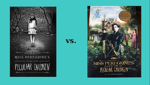
Miss Peregrine’s Home for Peculiar Children by Ransom Riggs
The inspiration for this book series was the author’s collection of vintage photographs. The original cover included one of those photos, whereas the redesign was about as Tim Burton as you get. Replacing the vintage photo with the movie poster lost what made the books so special in the first place. I’ve shown off my prized boxset of the trilogy and its bonus photos previously, read my post here!
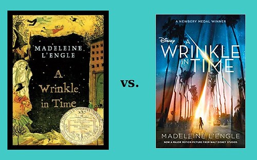
A Wrinkle in Time by Madeleine L’Engle
There have been countless covers for this classic book, but they all retained the sense of fantastical wonder of the story. The movie poster is really cool, but it just doesn’t feel right on the book.
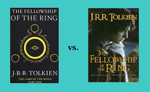
The Lord of the Rings by J.R.R. Tolkien
Okay I can’t do this anymore, I need to move on to something else less infuriating.
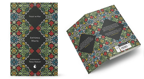
Virago Modern Classics
Virago is a feminist publishing house focused on putting out books from women and reprinting classics that have been forgotten over the decades. Recently, artist Yehrin Tong was given the task of redesigning some of their most popular books and the end result is utterly mesmerizing. Learn more about the artist and her inspirations here.
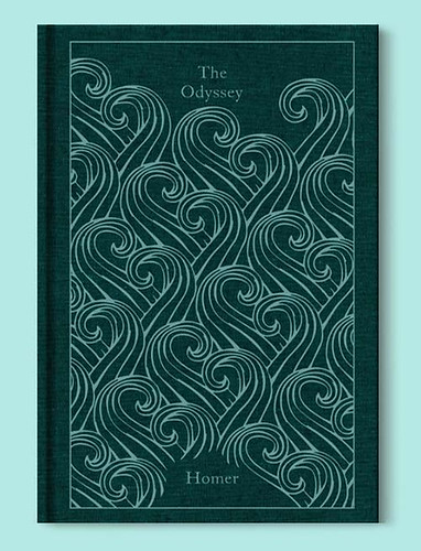
Penguin Clothbound Classics
For years I have had to exercise insane restraint from blowing my entire paycheck on these stunning books. They are truly special.
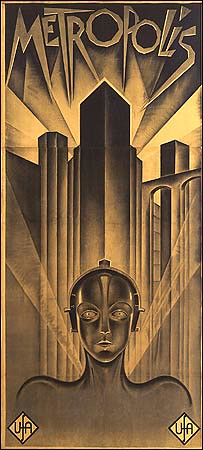
Harper Collins and Isaac Asimov
I own a few of these, drawn to the editions because of their sleek, classic sci-fi look. They also remind me of one of the first science-fiction movies ever, 1927’s Metropolis.
The Handmaid’s Tale by Margaret Atwood
I recently did a bookshelf scavenger hunt and this was one of my choices, mostly chosen so I could show you how gorgeous this edition is. Read the post here!
Jane Eyre by Charlotte Bronte
This redesign perfectly captures the gothic theme of Charlotte Bronte’s novel. It’s one of the many modern redesigns of classics that I adore.
Lolita by Vladimir Nabokov 
Although this one is a big fat NOPE
Wayfarers Series by Becky Chambers
While the redesigns of the awesome Wayfarer’s series are beautiful, I prefer the cheesy retro look of the original covers.
Do you agree/disagree with any of these? Which redesigns made your TTT this week? Let me know in the comments
Top Ten Tuesday is hosted by That Artsy Reader Girl.







I think I prefer the retro Wayfarers too. For the longest time after that cover was redesigned I actually didn’t even register it was the same book (I haven’t read it yet).
LikeLiked by 1 person
They’ve got a completely different feel and theme to them don’t they? It’s hard to recognise them as the same series! The originals are way more fun and are what drew me to them in the first place. I have all the ebooks on my Kindle but haven’t read them yet either.
LikeLiked by 1 person
I’m not alone then!! Haha- I feel like the only person who hasn’t read them yet.
LikeLiked by 1 person
Not everyone can see the face in the new cover of Handmaid’s Tale – can you see it?
LikeLiked by 1 person
In the cover I posted?
LikeLiked by 1 person
Yep! See the white dot? If you think of it as an eye, you’ll see the face to the right of the full figure. Look carefully!
LikeLiked by 1 person
It’s like Magic Eye all over again, I don’t see it!
LikeLiked by 1 person
See if you can see the outline of a nose below the white hood…
LikeLiked by 1 person
I love the artwork on that edition of Jane Eyre. I have the Wuthering Heights edition and love it.
My TTT https://thereadingrebel.wordpress.com/2019/08/06/top-ten-tuesday-book-cover-redesigns-you-loved-or-hated/
LikeLiked by 1 person
The Wuthering Heights one is beautiful too! Totally captures the bleakness of the story.
LikeLiked by 1 person
I’m a huge fan of the modernization of classic books, too. Hopefully, it will encourage more people to try titles they might not have picked up before.
My TTT.
LikeLiked by 1 person
I hope so too! I loved classics as a teen but I was weird then (and am weird now), so I’m not sure how much younger readers normally like them. At the very least they’ll be drawn in by the beautiful and/or cool looking covers.
LikeLike
Not going to lie I’ve never found a movie adaption cover I’ve liked. I have the movie adaption cover for Allegiant and I’m not a fan. I find that Jane Eyre cover kind of creepy tbh 😳
My ttt: https://bookslifeotheroddities.wordpress.com/2019/08/05/book-covers-i-insta-way-too-much/
LikeLiked by 1 person
We’ve definitely got a few in common! I adore that Handmaid’s Tale cover and the cloth bound classics are amazing! Those Virago designs are really pretty too! Great list! 😊
My TTT: https://lifewithallthebooks.com/2019/08/06/top-ten-tuesday-cover-redesigns-i-loved-hated/
LikeLiked by 1 person
I do enjoy when classics get a cool, modern cover! I’m also a huge fan of the Word Cloud classic editions.
-Lauren
http://www.shootingstarsmag.net
LikeLiked by 1 person
Oh my god those are so cool!!
LikeLike
That cover for A Wrinkle in Time was so disappointing and I’m forever pressed about it because it could have been magical. Wah! That being said, those covers from Virago Modern Classics are truly breathtaking and I can never look away from them when I see them. I just.. ugh. Beautiful. And the Penguin Clothbound editions are some of my favourites. I only own a couple but they’re amongst my most prized possessions re: literature.
LikeLiked by 1 person
I’ve added a few Penguin clothbounds to my Amazon wish list that I periodically send my husband. It’s titled “Surprise Your Wife” haha. I just found out yesterday The Secret Garden version will be released in September and I’m fully expecting to end up buying it the day it’s released.
LikeLike
Ewwww that Lolita cover is awful!!! But I do really like the Virago ones, I haven’t heard of them before! And I love the Penguin clothbound series ❤
LikeLike